How Simple AI Tools Improve Data Visualization for Startups
Startups don't need a data team to get real value from their data anymore. Here's what AI actually does differently in today's visualization tools — and which real, current tools to look at instead of vague "AI-powered dashboard" marketing.
The GetCoreTech Team Aug 29, 2026 · 10 min read · Updated Sep 12, 2026
How Simple AI Tools Improve Data Visualization for Startups
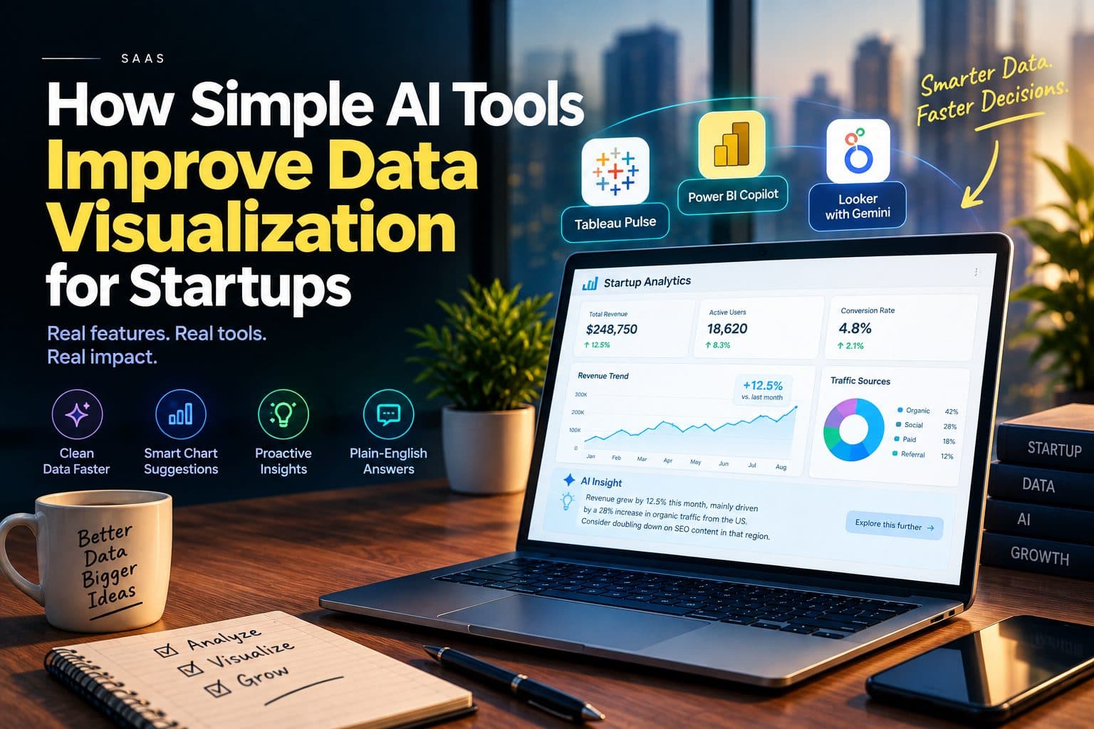
AI-powered data visualization tools now let startups clean data, pick the right chart type, catch trends automatically, and get a plain-language explanation of what changed — work that used to require a dedicated analyst or hours in a spreadsheet. The tools that actually deliver this are specific and checkable: features like Tableau Pulse, Power BI Copilot, and Looker's Gemini integration, not a generic "AI-powered dashboard" claim.
Why Data Visualization Matters More for Startups Than Anyone Else
Startups make decisions daily, often hourly, and rarely have a dedicated data team to translate raw numbers into something a founder can act on. A chart that surfaces a trend in seconds is worth more to a five-person team deciding where to spend its next marketing dollar than to a company with an analytics department already doing that work. For a resource-constrained team, visualization isn't a nice-to-have layer on top of the data — it's often the only realistic way anyone looks at the data at all.
The Problem With Traditional Data Visualization
Before AI features became standard in analytics tools, getting from raw data to a usable chart typically required spreadsheet fluency, some understanding of data modeling, and manual chart-building — work that non-technical founders either had to learn, delegate, or skip. Skipping it is the common outcome: many early-stage teams end up making calls on instinct not because they don't value data, but because turning it into something readable took more time and skill than they had available.
What Changed: What AI Actually Does Differently
"AI-powered" gets attached to almost every analytics tool now, so it's worth being specific about what the AI layer is actually doing in current products, rather than treating it as one undifferentiated feature.
Automated Data Prep
AI features in modern spreadsheet and BI tools can flag duplicates, catch missing values, and standardize formats automatically — the unglamorous cleanup work that used to eat the most time in any visualization project, now handled before a person opens the file.
Chart Type Suggestions and Natural-Language Queries
Rather than a founder guessing whether a trend belongs in a line chart or a comparison in a bar chart, current tools increasingly let you type a plain-English question and get a chart back. This is now close to table stakes across major platforms — Power BI Copilot generates visuals and narrative summaries from a prompt, and Looker's Gemini integration answers natural-language questions with charts pulled from connected data.
Proactive Insight Generation and Anomaly Detection
The more useful shift is tools that surface something before you ask. Tableau Pulse, for example, is built specifically to monitor metrics continuously and push a plain-language alert — "revenue dropped 12% this week, mostly in one region" — rather than waiting for someone to open a dashboard and notice. That's a meaningfully different workflow from a static report: the insight finds you instead of the other way around.
Natural-Language Explanations
Several current tools pair a chart with an auto-generated sentence explaining it — Power BI's narrative feature and Tableau Agent both do this, turning a chart that requires interpretation into one that states its own headline. For a founder scanning a dashboard between meetings, that's often the difference between a number that gets noticed and one that doesn't.
Real, Current Tools Worth Knowing About
Rather than a generic list of tool categories, here's what's actually available right now, organized by the kind of startup that tends to reach for each.
Power BI + Copilot is a strong fit if you're already in the Microsoft ecosystem. Power BI's Pro tier starts at roughly $14 per user per month, though Copilot's AI features specifically require an additional Fabric or Premium capacity add-on, which is worth checking before assuming it's included.
Tableau (Tableau Pulse and Tableau Agent) has AI features strongest for proactive metric monitoring and natural-language calculation building, though Tableau overall has a steeper learning curve and is generally better suited to a startup that expects to scale into a heavier analytics workload.
Looker Studio with Gemini is a natural fit if your data already lives in Google Sheets or BigQuery; Gemini's integration handles natural-language questions and can generate visualization configurations directly.
General-purpose AI data tools such as ChatGPT's data analysis features and Julius AI are useful for a startup that just needs to drop in a spreadsheet and ask questions in plain English without adopting a full BI platform, though these are best treated as a fast first pass rather than a governed, ongoing dashboard.
Where Startups Actually Use This
Sales performance — tracking daily and monthly sales, conversion rates, pipeline movement, and revenue forecasts without manually rebuilding a spreadsheet each week.
Marketing analysis — visualizing traffic sources, ad performance, and customer acquisition cost to see which channel is actually working, not just which one produces the most raw traffic.
Customer behavior and retention — surfacing engagement patterns, drop-off points, and feature usage to catch a retention problem while it's still small.
Financial monitoring — tracking burn rate, runway, and margins where a delay in noticing a shift can be an existential problem rather than an inconvenience.
Common Mistakes Startups Make With These Tools
Tracking too many metrics at once buries the two or three numbers that actually drive decisions. Feeding a dashboard messy or duplicated data and trusting the output anyway is a persistent problem — AI-assisted cleanup reduces it, but doesn't eliminate the need to sanity-check the source data. Building dashboards that mirror what's easy to measure rather than what the business actually needs to decide on next is another common failure. And treating an AI-generated explanation as the final word rather than a starting point — the plain-language summary is a hypothesis to check, not a verified conclusion.
Security and Privacy Considerations
Connecting a startup's sales, customer, and financial data into a third-party analytics tool is a real data-exposure decision, not just a workflow choice. The most concrete reference point for thinking this through is the NIST Cybersecurity Framework, now in its CSF 2.0 form, which organizes risk management into six functions: Govern, Identify, Protect, Detect, Respond, and Recover. In practical terms for a startup evaluating an AI analytics vendor, that translates to checking what data the tool actually needs access to versus what it's requesting, whether data is encrypted in transit and at rest, whether access controls are role-based rather than all-or-nothing, and whether the vendor has any third-party security certification (SOC 2 is the common one to ask about) rather than just a page of marketing claims about security.
What to Actually Expect Going Forward
Proactive, alert-style insights (the Tableau Pulse model) will become standard across more platforms rather than a differentiator. Natural-language querying will continue to improve in reliability, though it still depends heavily on how clean and well-structured the underlying data is. More startups will use a general-purpose AI tool for a fast first look at their data, then graduate to a dedicated BI platform once the data volume or stakeholder count grows. And vendor security posture will become a bigger part of the tool-selection conversation as more sensitive business data flows through these platforms.
Final Thoughts
The realistic case for AI in startup data visualization isn't that it replaces judgment — it's that it removes the setup cost that used to stand between a founder and their own numbers. Cleaning data, picking a chart type, and noticing a trend are now largely automated; deciding what to do about what the data shows is still squarely a human job, and the tools that are actually good at the first part free up time for the second.
FAQ
What are simple AI data visualization tools?
They're analytics platforms that use AI to reduce the manual work of turning raw data into charts and dashboards — automatically cleaning data, suggesting chart types, flagging trends or anomalies, and generating plain-language explanations. Current examples include Tableau Pulse's proactive metric monitoring, Power BI Copilot's natural-language chart generation, and Looker's Gemini integration.
Why is data visualization especially important for startups?
Startups typically make decisions fast and rarely have a dedicated data team, so a clear chart is often the only realistic way anyone on the team actually looks at the underlying numbers. Without accessible visualization, decisions tend to default to instinct, not because data isn't valued, but because turning it into something readable takes more time and skill than a small team has to spare.
How does AI make data visualization easier than traditional tools?
AI automates the steps that used to require the most manual effort: cleaning and standardizing data, suggesting an appropriate chart type for a given dataset, and — in more advanced tools like Tableau Pulse — proactively flagging a trend or anomaly before anyone goes looking for it. Several tools also generate a plain-language sentence explaining what a chart shows, rather than leaving the interpretation entirely to the viewer.
Do startups need technical or data science skills to use these tools?
Not for the tools built around natural-language queries and automated chart suggestions — Power BI Copilot and Looker's Gemini integration, for example, are designed to take a plain-English question and return a chart. General-purpose tools like ChatGPT's data analysis features or Julius AI go further, letting a non-technical founder drop in a spreadsheet and ask questions directly, though a full governed BI platform still benefits from someone who understands the underlying data model.
How do AI visualization tools help startups make better decisions?
The clearest gain is speed and reduced blind spots: proactive tools like Tableau Pulse can surface a metric shift before anyone thinks to check, and natural-language querying means a founder can ask a follow-up question in seconds instead of waiting on a rebuilt report. This doesn't replace judgment about what to do with the finding — it just shortens the time between a change happening and someone noticing it.
Can AI tools help startups understand customer behavior better?
Yes — visualization tools connected to product and customer data can surface engagement patterns, drop-off points, and feature usage without a founder manually cross-referencing spreadsheets. The value is in catching a retention problem or a spike in a specific segment while it's still small enough to act on cheaply.
Are AI data visualization tools expensive for startups?
It varies by tool and tier. Power BI's Pro tier starts around $14 per user per month, though its Copilot AI features require an additional Fabric or Premium capacity add-on that adds meaningfully to the cost. General-purpose tools built for quick data analysis are often available on lower-cost or free tiers, which makes them a reasonable starting point before committing to a full BI platform.
What types of data can startups visualize using AI tools?
Most commonly: sales and pipeline data, marketing and ad performance, website and product usage data, customer behavior and retention metrics, and financial data like burn rate and runway. Most current tools connect directly to common business platforms and spreadsheets, so combining several of these into one view doesn't require custom engineering.
What mistakes should startups avoid when using AI data visualization tools?
The most common ones are tracking too many metrics at once (which buries the few that actually matter), feeding a dashboard messy source data and trusting the output anyway, and treating an AI-generated explanation as a final answer rather than a starting point worth double-checking. AI removes friction in the process, but it doesn't remove the need for someone to sanity-check what the tool produces.
How will AI data visualization tools evolve for startups?
The proactive, alert-driven model that Tableau Pulse represents — where the tool flags a change rather than waiting to be asked — is likely to become standard across more platforms rather than a differentiator. Natural-language querying should keep improving, though its reliability still depends heavily on how clean the underlying data is, and vendor data security is likely to become a bigger factor in tool selection as more sensitive business data moves through these platforms.
FAQ
They're analytics platforms that use AI to reduce the manual work of turning raw data into charts and dashboards — automatically cleaning data, suggesting chart types, flagging trends or anomalies, and generating plain-language explanations. Current examples include Tableau Pulse's proactive metric monitoring, Power BI Copilot's natural-language chart generation, and Looker's Gemini integration.
Startups typically make decisions fast and rarely have a dedicated data team, so a clear chart is often the only realistic way anyone on the team actually looks at the underlying numbers. Without accessible visualization, decisions tend to default to instinct, not because data isn't valued, but because turning it into something readable takes more time and skill than a small team has to spare.
AI automates the steps that used to require the most manual effort: cleaning and standardizing data, suggesting an appropriate chart type for a given dataset, and — in more advanced tools like Tableau Pulse — proactively flagging a trend or anomaly before anyone goes looking for it. Several tools also generate a plain-language sentence explaining what a chart shows, rather than leaving the interpretation entirely to the viewer.
Not for the tools built around natural-language queries and automated chart suggestions — Power BI Copilot and Looker's Gemini integration, for example, are designed to take a plain-English question and return a chart. General-purpose tools like ChatGPT's data analysis features or Julius AI go further, letting a non-technical founder drop in a spreadsheet and ask questions directly, though a full governed BI platform still benefits from someone who understands the underlying data model.
The clearest gain is speed and reduced blind spots: proactive tools like Tableau Pulse can surface a metric shift before anyone thinks to check, and natural-language querying means a founder can ask a follow-up question in seconds instead of waiting on a rebuilt report. This doesn't replace judgment about what to do with the finding — it just shortens the time between a change happening and someone noticing it.
Yes — visualization tools connected to product and customer data can surface engagement patterns, drop-off points, and feature usage without a founder manually cross-referencing spreadsheets. The value is in catching a retention problem or a spike in a specific segment while it's still small enough to act on cheaply.
It varies by tool and tier. Power BI's Pro tier starts around $14 per user per month, though its Copilot AI features require an additional Fabric or Premium capacity add-on that adds meaningfully to the cost. General-purpose tools built for quick data analysis are often available on lower-cost or free tiers, which makes them a reasonable starting point before committing to a full BI platform.
Most commonly: sales and pipeline data, marketing and ad performance, website and product usage data, customer behavior and retention metrics, and financial data like burn rate and runway. Most current tools connect directly to common business platforms and spreadsheets, so combining several of these into one view doesn't require custom engineering.
The most common ones are tracking too many metrics at once (which buries the few that actually matter), feeding a dashboard messy source data and trusting the output anyway, and treating an AI-generated explanation as a final answer rather than a starting point worth double-checking. AI removes friction in the process, but it doesn't remove the need for someone to sanity-check what the tool produces.
The proactive, alert-driven model that Tableau Pulse represents — where the tool flags a change rather than waiting to be asked — is likely to become standard across more platforms rather than a differentiator. Natural-language querying should keep improving, though its reliability still depends heavily on how clean the underlying data is, and vendor data security is likely to become a bigger factor in tool selection as more sensitive business data moves through these platforms.
The GetCoreTech Team
We write about the SaaS, AI, and infrastructure decisions builders actually have to make.
Comments
Log in or sign up to join the discussion.
Loading comments…